The Matching-Set Myth: Why Coordinated Clothes Need Not Be Identical
Coordinated clothes need not match exactly. Use repeated tones, shapes or textures to make an outfit feel connected without looking like a uniform.
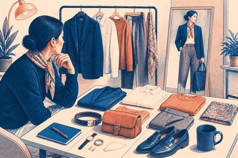
Why do coordinated clothes sometimes look more like a uniform than an outfit? The matching-set myth says every visible element must share a colour, print or finish. In practice, coordinated clothes can feel connected through a repeated tone, shape or texture, while each piece keeps its own character.
The distinction is useful when getting dressed with a partner, choosing accessories, or wearing separates that came from different shops. Exact matches can be pleasing, but they are only one option. If an outfit feels too arranged, identify what is repeating and loosen one part of the pattern rather than abandoning coordination altogether.
When everything looks like a set
What goes wrong: A jacket, trousers, shoes and bag all appear to belong to the same matching collection, even if they were bought separately.
What usually causes it: Too many details repeat at once. The pieces may share the same colour, fabric finish, scale of pattern and degree of formality. Each similarity strengthens the others, so the eye reads them as a preassembled set rather than as separate choices.
What to try: Keep one clear point of connection and change another. If your navy jacket and trousers are close in colour, introduce a shirt in a quieter contrasting tone, or choose shoes with a different texture. If a printed scarf already repeats the jacket’s colour, avoid adding several more accessories in that exact shade.
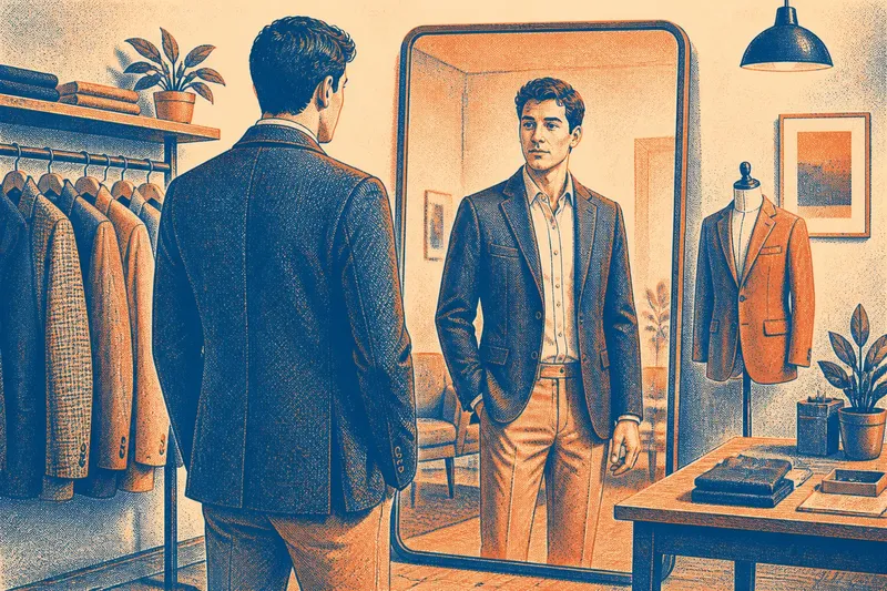
Think of coordination as a relationship, not a uniform. One repeated element gives the eye something to recognise; differences in cut, texture or colour keep the pieces distinct. A wool jacket and smooth cotton trousers can share a dark tone without pretending to be a suit.
When near-matches look accidental
What goes wrong: Two pieces seem almost, but not quite, the same colour. A cream shirt beside a pale beige jacket may look like a failed attempt to match rather than a deliberate combination.
What usually causes it: Colour names are broad, and fabric changes how a colour appears. A warm ivory and a cool white can sit differently next to skin; a soft, brushed surface also catches light differently from a smooth one. The closer two shades are, the more noticeable their small differences can become.
What to try: Either make the difference clearer or give the near-match a bridge. A darker belt, a patterned scarf containing both shades, or a third colour between them can make the contrast feel intentional. You might also move one item farther from the face, where a subtle shift in undertone is less likely to dominate the look.
Check the combination in the light in which you expect to wear it. A colour that seems close under a warm bedroom lamp may separate more sharply in daylight. You do not need to chase a perfect match; the useful question is whether the distinction reads as chosen.
When colour repetition feels forced
What goes wrong: A small accent is repeated on a scarf, socks, bag and jewellery, making the outfit feel as if every item has been assigned a colour cue.
What usually causes it: Repetition is being treated as a rule rather than a choice. A colour can connect two parts of an outfit without appearing on every accessory. Repeating it too often may give a small detail more emphasis than you intended.
What to try: Let one item carry the accent and echo it once elsewhere, perhaps in a small print or a subtle piece of jewellery. If you are wearing a green patterned scarf, a green bag can make a clear link; green socks and earrings may be unnecessary. Alternatively, repeat the colour in a different proportion, such as a broad scarf pattern and a narrow belt.
For example, say you are dressing for a casual afternoon and want a burgundy knit to sit comfortably with charcoal trousers. Choose a bag with a small burgundy detail rather than searching for an exact knit-to-bag match; the expected result is a visible connection that leaves the jumper as the main colour statement.
When accessories compete
What goes wrong: Jewellery, a belt, a bag and shoes all demand attention, so the outfit feels busy rather than connected.
What usually causes it: Every accessory has been asked to perform the same job. Matching metals or leathers can create coherence, but identical finishes are not the only way to achieve it. Several prominent accents may compete even when their colours agree.
What to try: Decide which accessory should lead. If a patterned bag is the focal point, let the shoes be simpler and use a belt that supports the outfit’s colour without repeating the bag’s exact finish. If you prefer statement jewellery, keep other accessories less elaborate.
Materials can connect unlike items. A matte leather belt and a brushed metal watch may both feel understated, even though neither matches the other. Consider their visual weight as well as their colour: a broad, shiny buckle can attract more attention than a fine chain.
When coordination loses its ease
What goes wrong: Clothes look coordinated on a hanger but feel stiff or overly formal once worn, or several people in a group appear dressed for the same occasion in identical colours.
What usually causes it: The pieces share not only a colour but also the same formality, silhouette or degree of polish. For a group, a request to “match” may be interpreted as a demand for identical clothing. In either situation, coordination has become a uniform because there is no room for individual variation.
What to try: Keep the shared idea broad and let people or pieces interpret it differently. A group might choose a family of muted colours rather than one precise shade; one person could wear a blue shirt, another a patterned scarf with blue in it. For an outfit, pair a crisp piece with a relaxed one, such as a neat jacket over a soft cotton top.
Set the level of formality before deciding on colour. A polished shoe and an informal jacket may sit awkwardly together even if their tones work well. You can bring them closer by changing one item’s texture or shape, rather than trying to make every piece identical.
Questions about coordination?
Do shoes have to match a bag?
No. They can share a colour, texture or level of formality without being made from the same material or shade. If both are prominent, let one be quieter so they do not compete.
Can different shades of one colour work together?
Yes, especially when the difference looks deliberate. Pair a clear light-and-dark contrast, or use a patterned item that contains both tones to connect them.
How many details should repeat?
There is no fixed count, but one or two clear links often feel easier to read than a repeated accent on every accessory. Look at the whole outfit from a little distance and notice which detail catches your eye first.
How can a group coordinate without dressing alike?
Agree on a loose cue, such as a colour family, a level of formality or a shared texture, then let each person choose their own clothes. The result can feel connected while leaving room for different tastes and wardrobes.
What is not worth matching
It is rarely worth buying a new accessory solely to reproduce the exact shade or finish of something you already own. Small variations can be hard to assess in a shop and may make little difference once the full outfit is on. Start with the clothes and accessories you have, then look for a useful link in their existing tones, shapes or materials.
When an outfit feels off, name the problem before changing everything. If it looks too much like a set, vary the texture or formality; if near-matches seem accidental, clarify the contrast; if accessories compete, let one lead. Coordinated clothes do not need identical twins: one considered echo is often enough to make the parts belong together.