Rust and Rose: Two Ways to Pair Warm Colours
Rust and rose colour pairings can feel either blended or lively: learn how tonal depth, contrast and small details shape the mood of an outfit.
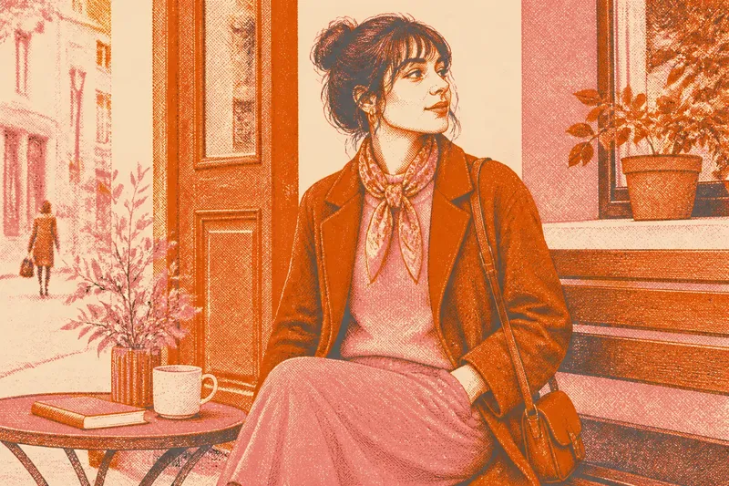
How can rust and rose sit together without one colour swallowing the other? Rust and rose colour pairings work in two distinct ways: they can share a gradual, tonal warmth, or meet as a deliberate contrast. The difference comes less from a strict colour rule than from each shade’s depth, softness and place in the outfit.
Warmth in two colours
Rust is an earthy orange-red, usually dulled by brown. Rose ranges from pale, powdery pink to a deep red-pink. Both can carry warm undertones, but they do not have to look alike: a dusty rose may appear gentle beside vivid copper, while a saturated rose can hold its own against dark rust.
In clothing, “tonal” means that colours sit close together in character or value, so the transition feels gradual. “Contrast” means that a noticeable difference—such as light against dark or muted against clear—makes the boundary between them more visible. A pairing can be warm in both cases; the distinction is how strongly the colours separate.
Fabric changes that reading. Brushed wool, corduroy and matte cotton scatter light softly, which can make adjacent shades seem more blended. Satin or smooth leather reflects more light and can make a colour look sharper. Compare the actual garments in daylight if possible: shop lighting can shift rose towards peach or make rust look redder than it does outdoors.
Tonal warmth
For a tonal outfit, choose rust and rose that share a quality. Two muted shades will feel quiet and earthy; two clearer shades will feel more vivid without losing their connection. The colours need not match in depth. A pale rose blouse beneath a deep rust cardigan gives the outfit a soft-to-dark progression, while the related warmth keeps it from feeling divided.
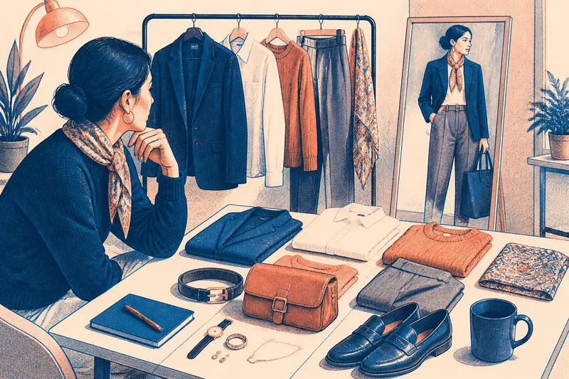
Another route is to vary texture rather than hue. A rose knit with rust-coloured trousers can feel more layered if one surface is soft and the other has a firmer weave. The textures supply definition while the colours remain close in mood. Keep accessories in a neighbouring neutral, such as cream, warm brown or soft charcoal, if you want the pairing to remain the main event.
Say you have a muted rose jumper and a rust skirt with a brown cast. Wear them together, then add cream shoes or a brown belt. The expected effect is a connected, gently earthy outfit, with the lighter neutral giving the two warm colours room to read separately.
Intentional contrast
Contrast becomes clearer when one shade is lighter, brighter or more saturated than the other. A deep rust coat over a cool, pale rose top has a more graphic quality than two dusty shades. The rose catches the eye first; the rust gives it visual weight. Reversing the proportions—a rose coat with a small rust detail—changes which colour leads without changing the palette.
Scale matters as much as shade. A large area of rust with a narrow rose scarf creates a restrained accent. Similar areas of both colours make their boundary more prominent, especially in simple shapes such as a plain jumper and straight-leg trousers. If the result feels too forceful, try a softer or greyer version of one colour before adding another accent.
Print can also provide a bridge. A scarf patterned with rose, rust and a little cream carries both colours in one surface, so separate garments feel related without becoming identical. A print with tiny amounts of one shade will not balance an outfit in the same way as a broad block; look at the overall impression from a few steps away.
Choosing the mood
Tonal warmth tends to read as calm, blended and grounded. Contrast tends to feel more animated and deliberate. These are visual tendencies, not fixed meanings: silhouette, fabric, light and the wearer’s own associations all affect the impression. Neither approach is inherently more polished or more expressive.
To decide between them, consider what you want the colours to do. If you want them to recede into a cohesive outfit, keep their saturation and softness similar, then use texture or depth for separation. If you want the relationship itself to be noticeable, make one colour lighter, darker or clearer and give that difference enough space to register.
It is not worth searching for an exact colour match across different fabrics. A rust wool coat and a rust cotton shirt may look unlike each other under the same light, and a near-match can draw more attention than a purposeful difference. Aim for a shared quality—such as mutedness or depth—instead.
Questions about rust and rose?
Does rust go with pink?
Yes. Rose is a pink family, and its warmth can connect naturally with rust. A dusty rose makes the pairing softer, while a brighter or deeper rose creates a more visible contrast.
Which colour should be more prominent?
Either can lead. Let the colour you want noticed first occupy more visual space, or place it nearer the face if that suits the outfit’s purpose. A small accent can still stand out when its contrast is strong.
Can I wear rust and rose in a print?
Yes; a print can bring the shades together without requiring a precise match. Check whether the pattern reads mainly as one colour or as a balanced mix, then choose plain garments that support that impression.
What neutrals work with both?
Cream, warm brown and soft charcoal can sit comfortably beside many rust-and-rose combinations. Choose a neutral that fits the outfit’s overall depth: a pale cream may lift dark shades, while brown can preserve an earthy feel.
Read the whole outfit
Rust and rose colour pairings become easier to judge when you look beyond the swatches. Notice the outfit in daylight, consider how much of each shade is visible, and check whether the fabric finish softens or sharpens the boundary. For a blended mood, keep the colours close in character; for a lively one, make their difference intentional.
Start with garments already in your wardrobe rather than buying a perfect third piece to mediate between them. A cream shirt, brown belt or printed scarf can help, but it is optional: if the colours already feel clear together, leave the space between them alone.